
6 Best Color for an Outdoor Privacy Screen: A Complete Guide
Table of Contents
- Introduction
- Importance of Color Choice for Outdoor Privacy Screens
- Top Color Options for Outdoor Privacy Screens
- Factors to Consider When Choosing a Color
- Patavin LINE Outdoor Privacy Screen POST KIT 8' - L8
- Design Tips for Matching Color and Style
- Summary Table
Introduction
Outdoor privacy screens are more than just functional—they contribute to your exterior’s aesthetic appeal, increase comfort, and help define outdoor spaces. Among the many design choices you’ll make, selecting the best color for an outdoor privacy screen is one of the most impactful. The right color can elevate your patio, yard, or balcony by blending in or making a bold statement.
Importance of Color Choice for Outdoor Privacy Screens
Choosing the right color for your privacy screen is essential because:
- Enhances Visual Appeal: The right color complements surrounding elements like furniture, landscaping, and the building facade.
- Defines Space: Color can set the tone for your outdoor area, making it feel cozy, open, vibrant, or serene.
- Reflects Personal Style: Neutral tones convey elegance; bold hues showcase confidence and creativity.
- Affects Temperature and Light: Dark colors absorb more heat, while lighter colors reflect sunlight.
Top Color Options for Outdoor Privacy Screens
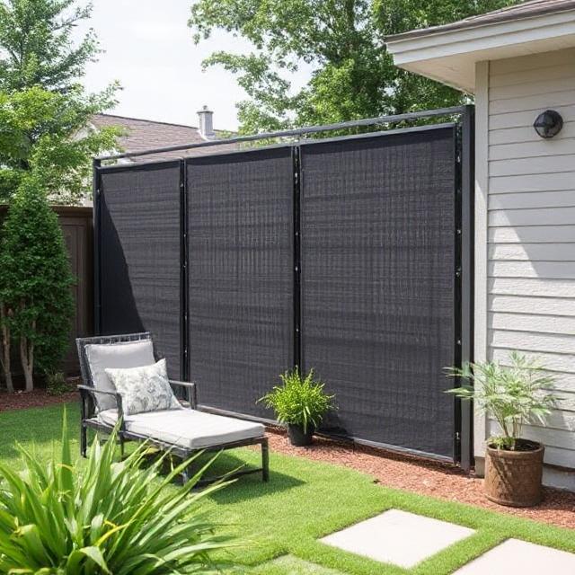
1. Matte Black

LINE Outdoor Privacy Screen POST KIT 8' - L8
Why it’s popular: Modern, sleek, and elegant, matte black is a favorite for urban and minimalist designs. It pairs well with metal, wood, and composite planks and provides a clean backdrop for greenery.
- Creates contrast with light wood or white exteriors
- Hides dirt and weathering well
- Ideal for contemporary and industrial-style homes
2. Natural Wood Tones

Whether stained cedar, teak, or pine, natural wood tones bring warmth and earthiness to any outdoor space. These colors integrate seamlessly with landscaping and garden aesthetics.
- Perfect for rustic and traditional homes
- Can be stained darker or lighter to match design themes
- Fade naturally over time, gaining a vintage look
3. Gray and Charcoal

Cool-toned grays provide a neutral, understated look that works with nearly every design. From light gray to deep charcoal, these tones are trending for their modern appeal.
- Excellent for pairing with stone, concrete, or white trim
- Low maintenance and visually balanced
4. White and Off-White
For a fresh and clean look, white or off-white privacy screens brighten up small spaces and reflect light beautifully. However, they may require more upkeep to stay clean.
- Ideal for Mediterranean or coastal homes
- Creates a feeling of openness and space
5. Forest Green and Olive
Green tones are ideal for blending privacy screens into natural settings. They work especially well in gardens, wooded backyards, and beside hedges.
- Helps privacy screens disappear into foliage
- Promotes a sense of calm and nature
6. Bold Colors (Blue, Red, Terracotta)
If you're going for an expressive and artsy look, vibrant hues like navy blue, brick red, or terracotta can add character to your patio or deck.
- Best used as accent features
- May work well in eclectic or boho-styled spaces
Factors to Consider When Choosing a Color
Climate and Weather Exposure
- Dark colors may fade faster under strong sunlight.
- Lighter shades may show dirt or stains more easily.
Surrounding Elements
- Match with house trim, siding, and nearby structures.
- Consider plant color schemes and patio furniture.
Material Type
- Wood stains offer more grain visibility.
- Composite boards come in pre-determined colors.
Maintenance Needs
- Darker colors are low-maintenance for dirt but may require UV protection coatings.
- Bright or light finishes may require frequent cleaning.
Patavin LINE Outdoor Privacy Screen POST KIT 8' - L8

When considering modular systems like the Patavin LINE Outdoor Privacy Screen POST KIT 8' - L8, color becomes even more flexible. This premium fencing solution features a matte black aluminum post designed to integrate seamlessly with various plank colors.
Key Benefits:
- Rustproof & weather-resistant: Thanks to its powder-coated finish, matte black aluminum retains color under tough weather conditions.
- Universal design: Accepts 5/4" thick wood or 1" composite planks—paint or stain them in any preferred color.
- Quick assembly: Sliding rail system allows for easy setup without tools—change out planks as your design evolves.
Design Suggestions with Patavin Kit:
- Pair matte black posts with natural cedar planks for a modern-rustic look.
- Use charcoal gray composite planks for a minimal and professional appearance.
- Mix black with light-stained pine for Scandinavian-inspired aesthetics.
Design Tips for Matching Color and Style
Coordinate with Landscape Features
- Use earth tones like brown, green, or tan to match plant life.
- White or gray pairs well with stone pavers or concrete patios.
Use Color Psychology
- Black: Strength, sophistication, modernism
- Green: Harmony, freshness, calm
- Blue: Cool, tranquil, clean
- White: Purity, openness, minimalism
Blend or Contrast
- For a subtle look, match screen colors with your siding or deck.
- For high contrast, pair dark posts with light boards or vice versa.
Summary Table
| Color | Style Impact | Best For | Maintenance |
|---|---|---|---|
| Matte Black | Modern, sleek, versatile | Urban homes, contemporary patios | Low |
| Natural Wood | Warm, rustic, timeless | Traditional gardens, decks | Medium (stain or seal periodically) |
| Charcoal Gray | Neutral, clean, stylish | Modern or transitional homes | Low |
| White | Bright, open, fresh | Coastal or Mediterranean styles | High (shows dirt easily) |
| Forest Green | Natural, calming, soft | Wooded or garden areas | Medium |
| Bold Colors | Artistic, vibrant, statement-making | Creative, eclectic spaces | Varies (depends on finish) |